
Web design and development is constantly evolving. What once looked like the pinnacle of ingenuity can very quickly become a parody of the past (jpeg filled static “90’s style” websites spring to mind). Keeping your finger on the pulse can be a tricky business, but thankfully, trends can be predicted and sometimes, you can even set them.
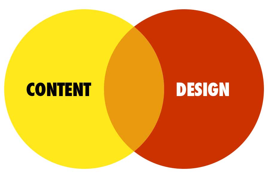
Since website design is being dictated by user experience, we’ll take a closer look at the features and technologies which are changing the way we browse the internet.
Design Style Trends

Dark Website Designs
Dark Mode has become extremely popular with a significant number of users now browsing the internet on their mobile devices. This is simply an option to turn the whitespace of the website into blackspace, which is easier on the eyes in low light situations.
Dark Mode designs are usually limited to mobile devices and mainly appear in mobile applications. This feature, although not currently required, is rising in popularity and seems to be set to take its place as an expected feature of future mobile applications and websites.
Asymmetric Designs
As technologies evolve and developers innovate, we’re seeing a shift from the standard website layouts and perfectly symmetrical elements. This works particularly well on websites with lots of information to share, allowing the users to browse freely instead of being forced down a specific route. There are even some websites that refuse to use the old grid style, opting for a free flowing website usually consisting of multiple slides connected with some fancy CSS.
Of course, grid style websites have their place and aren’t going anywhere anytime soon, but having a little creative thought and allowing yourself to see outside the constraints of what a website should look like, you could easily create something that becomes the next big trend.
Material Design & Material UI
Designed by Google, Material Design is a unified system that combines theory, resources, and tools for crafting digital experience. This framework uses a repository called Material UI, which are essentially React components designed for faster and easier web development
This allows developers to create applications that work seamlessly with any device on any browsers, creating the kind of continuity every company is looking for. While design trends are never really down to a framework being released (more so the framework copies the latest design trends) it is becoming a more popular method of creating web applications and could very soon be seen as an industry standard.
Website Imagery Trends
Stylisation
We’ve all been into an image stock repository before, browsing those clean-cut models posing in a variety of different professional situations. These images were a staple for most websites over the years, but more and more websites are moving away from the photogenic faces and opting for digital imagery or illustrations for that more approachable and natural feel.
Technology
Google has been pushing their idea of the perfect image format through their PageSpeed Insights tool for a while now. The next generation of image compression comes in three varieties; JPEG 2000, JPEG XR, and WebP.
While these formats are exceptional at delivering a lossless image at incredibly compressed file sizes, they aren’t fully supported by all browsers. If you plan to make the move to any of the above formats, it would be wise to check your audience demographics and ensure they work on the browsers your users choose to view your website.
Microinteractions

Microinteractions are interactive animations created in CSS and Javascript which populate and move depending on the actions of the user. A common example of this is a dynamic background with dots linked together with lines. As you move your mouse around the webpage, the dots and lines are repelled by the cursor and move when your cursor gets close.
Websites that feature an Asymmetric Design usually benefit from the additional visual aspects Microinteractions offer.
Modular Website Design
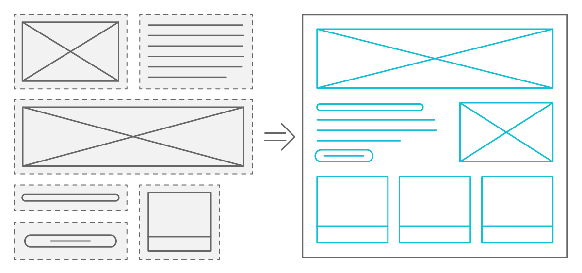
Gone are the days when a website was only manageable by the developer who created it. Instead of having to learn how to code, modular website designs allow inexperienced users to develop webpages and develop their website as time goes on.
Modular Websites will usually be created in a CMS such as WordPress. Developers can edit the core WordPress files to create custom and bespoke solutions for specific business needs. By creating elements that can be managed directly through the CMS, you mitigate the need for a developer on an expensive retainer and minimise the need for plugins (we’ll dive into why that’s important in next week’s blog).